Share on
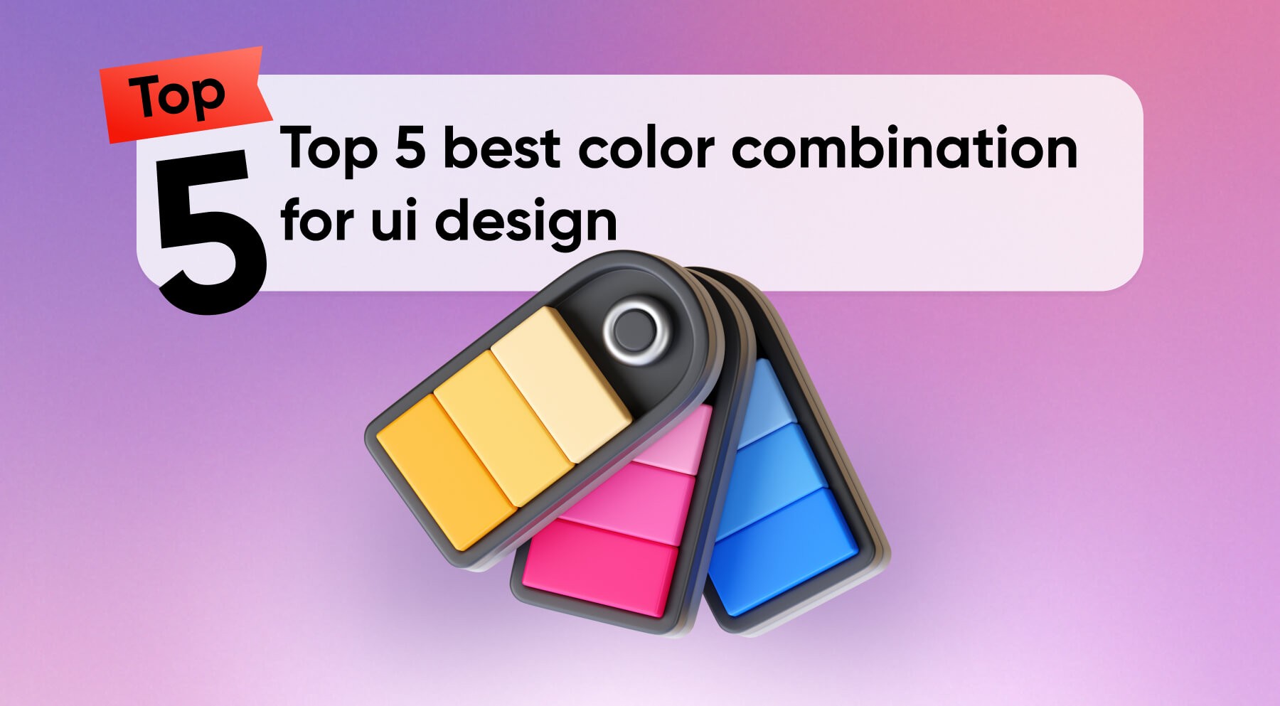
Have you ever wondered why some apps and websites just feel “right” while others leave you squinting or confused? The secret often lies in the color palette. Choosing the best practice color combination for UI design isn’t just about aesthetics—it’s about creating an intuitive, engaging, and memorable user experience design.
The right colors can guide users through your interface, evoke specific emotions, and even increase conversion rates. In this post, we’ll explore how to harness the power of color to elevate your UI design from good to unforgettable, ensuring your users stay engaged and your product stands out in a crowded digital landscape. Stay tuned for insights on UI design trends and UX/UI best practices.
1. The Golden Contrast — #F8CC22 & #3E3F4D
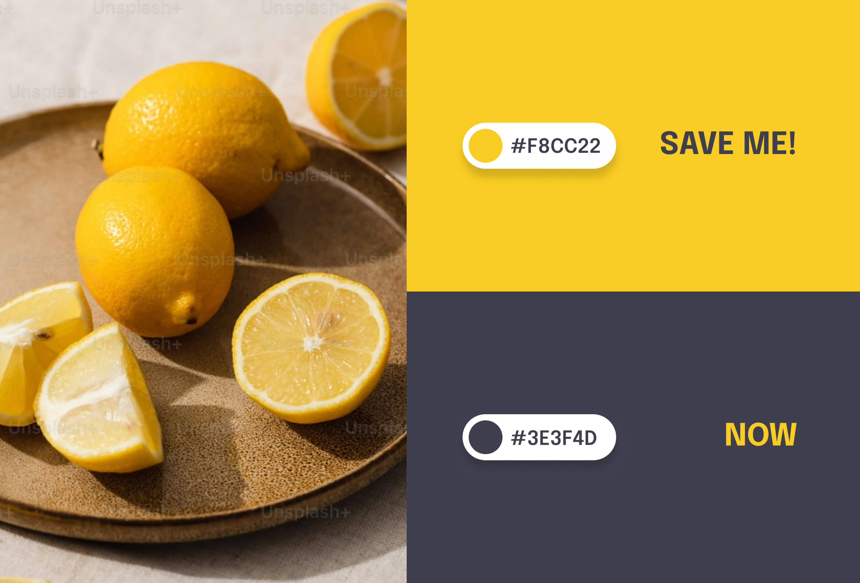
This vibrant yellow (#F8CC22) paired with a deep slate blue (#3E3F4D) creates a striking and modern color combination that's perfect for capturing attention and conveying energy.
Benefits:
High contrast for improved readability and accessibility
Evokes feelings of optimism and professionalism
Ideal for call-to-action buttons and important UI elements
Versatile enough for both light and dark mode interfaces
Creates a strong visual hierarchy, guiding users' attention effectively
Best used for:
Tech startups and innovative brands
Financial applications seeking a fresh, trustworthy appearance
Educational platforms aiming to energize and engage users
2. Earthy Elegance — #533832 & #E1C3AD
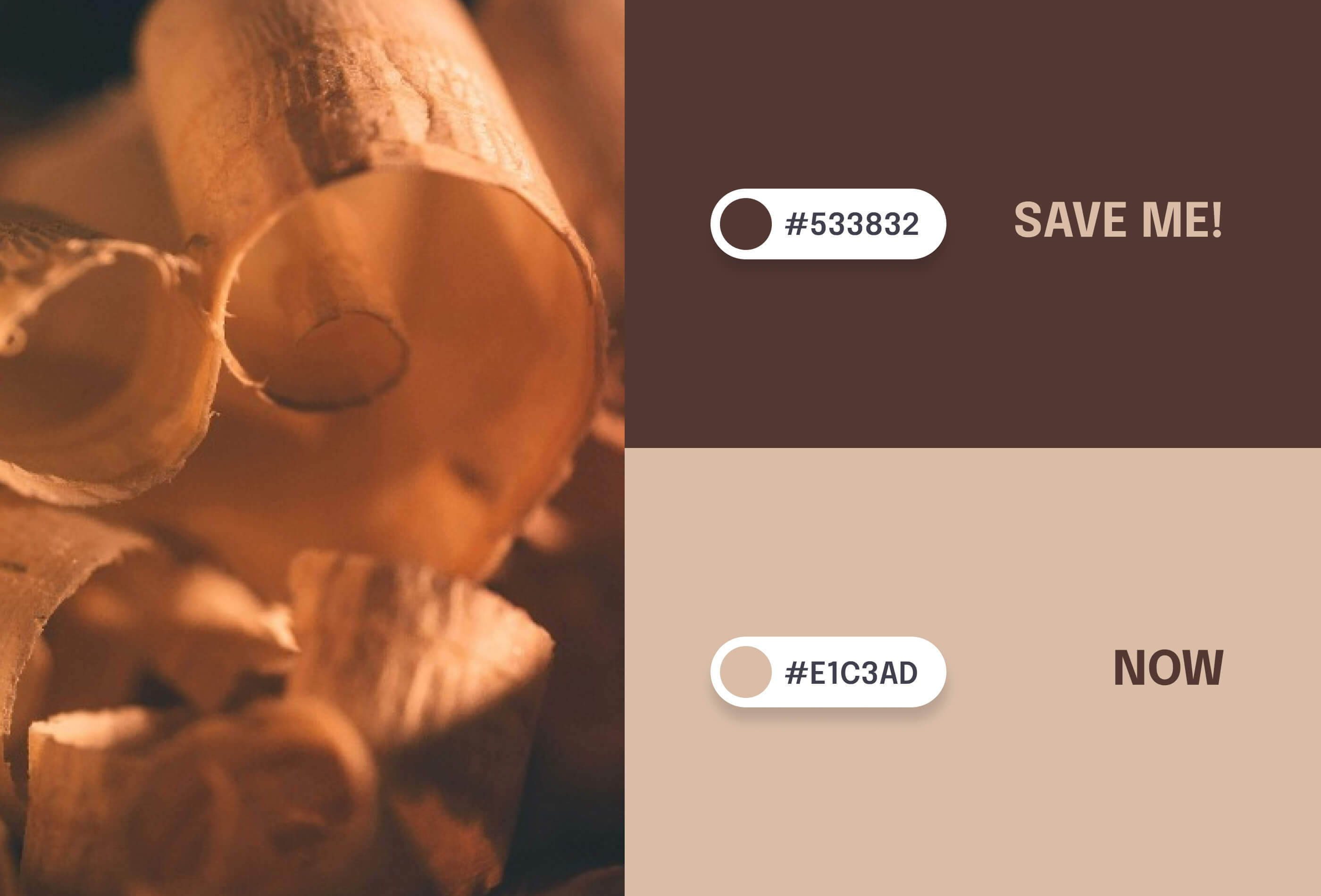
This rich brown (#533832) combined with a soft beige (#E1C3AD) offers a warm, natural palette that exudes sophistication and comfort.
Benefits:
Creates a sense of reliability and stability
Reduces eye strain with its muted tones
Perfect for long-form content and extended user sessions
Conveys an eco-friendly or organic brand image
Versatile for both traditional and modern design aesthetics
Best used for:
Sustainable and eco-conscious brands
Luxury or artisanal product websites
Health and wellness applications
Interior design or home decor platforms
Book or reading-focused apps seeking a cozy, inviting feel
3.Romantic Sophistication — #B2456E & #FBEAE7
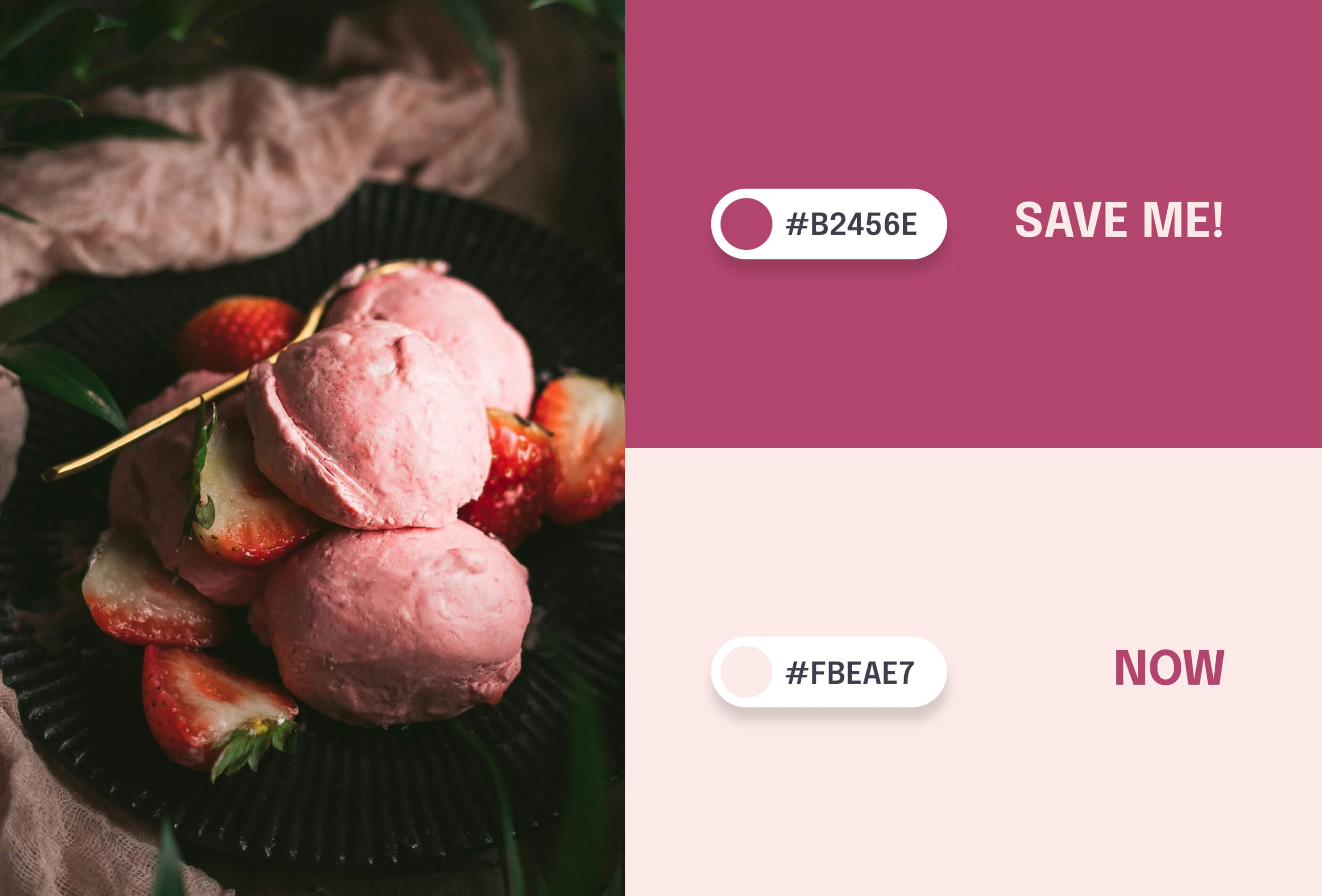
This deep rose (#B2456E) paired with a soft blush (#FBEAE7) creates a refined and elegant color scheme that balances warmth with professionalism.
Benefits:
Evokes feelings of comfort and luxury
Provides enough contrast for good readability without being harsh
Appealing to a wide range of users, particularly effective for female-oriented brands
Versatile for both light and dark mode interfaces
Creates a welcoming atmosphere while maintaining a professional look
Best used for:
Beauty and cosmetics websites
Fashion and lifestyle blogs
Wedding planning platforms
High-end retail or e-commerce sites
Health and wellness apps focusing on self-care
4. Trustworthy Serenity — #00246B & #CADCFC
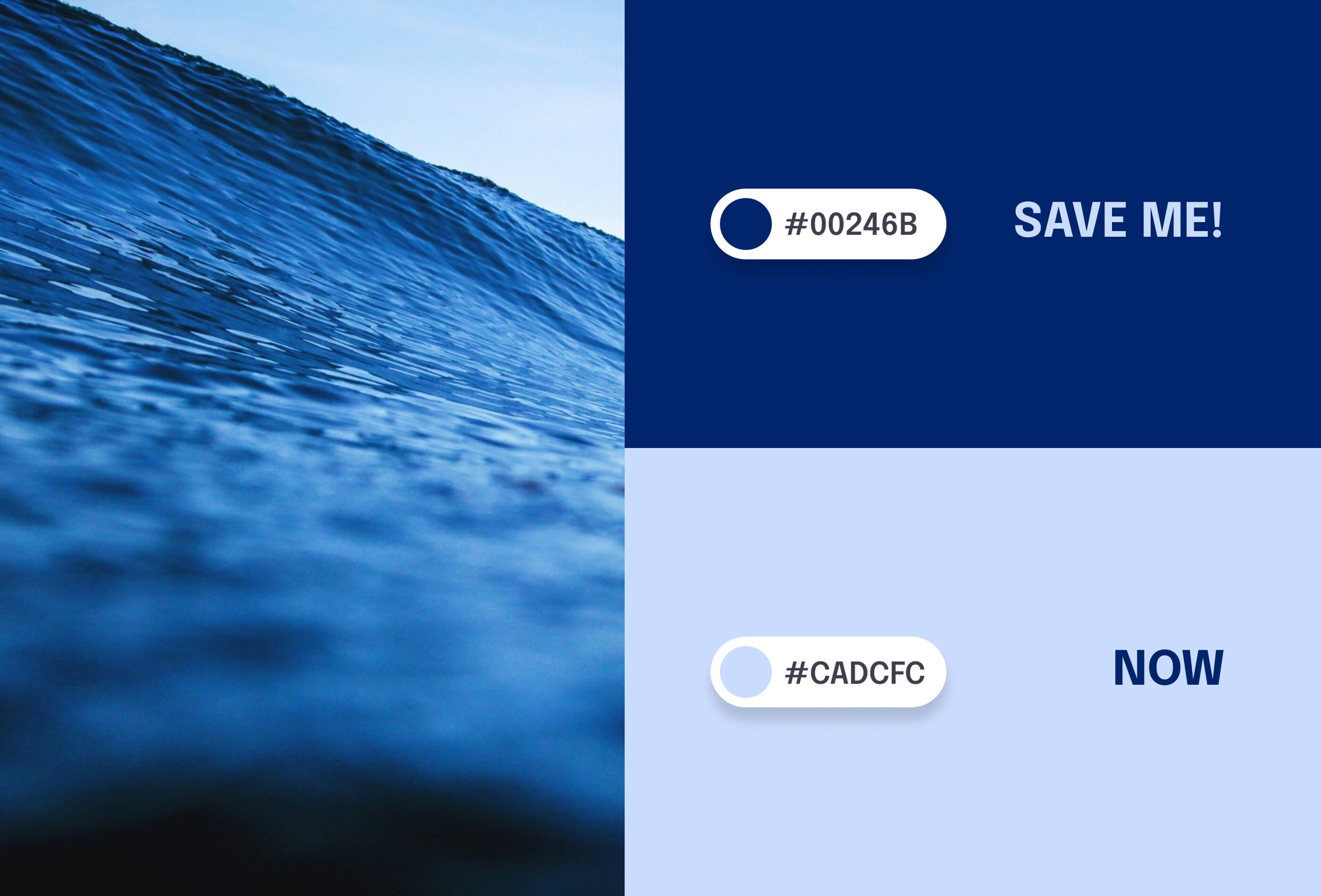
This deep navy (#00246B) combined with a light periwinkle (#CADCFC) offers a calming yet authoritative color palette that inspires confidence and tranquility.
Benefits:
Conveys professionalism, trust, and reliability
Excellent contrast for improved readability and accessibility
Reduces eye strain, making it suitable for data-heavy interfaces
Versatile for both corporate and creative applications
Creates a sense of depth and space in UI designs
Best used for:
Financial and banking applications
Healthcare and medical interfaces
Professional networking platforms
Educational websites and e-learning portals
Productivity and project management tools
5.Eco-Chic Harmony — #31473A & #EDF4F2
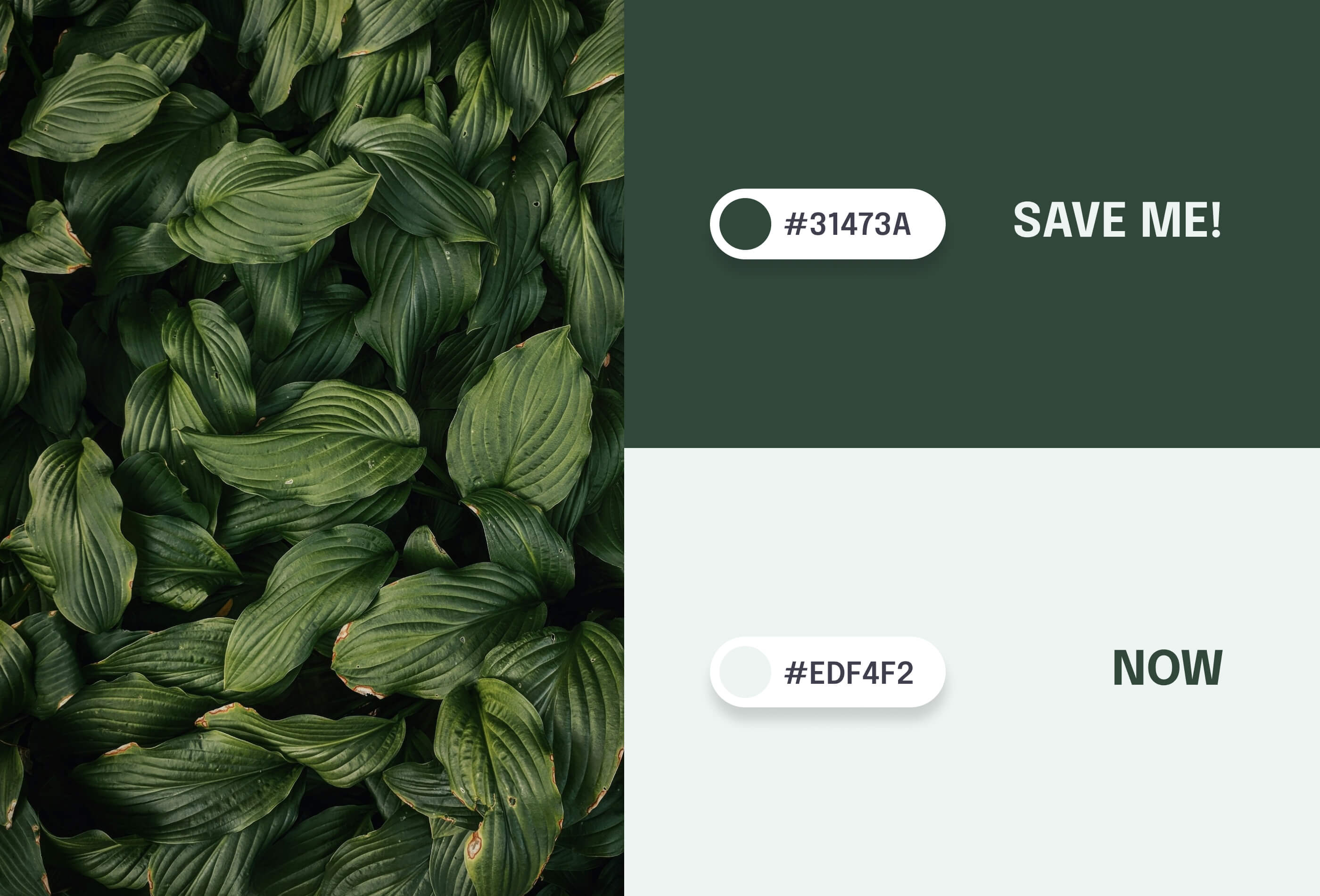
This deep forest green (#31473A) paired with a crisp mint white (#EDF4F2) creates a refreshing and balanced color scheme that evokes nature and tranquility.
Benefits:
Promotes a sense of calm and well-being, reducing user stress
Offers excellent readability with its high contrast ratio
Conveys a message of sustainability and eco-friendliness
Versatile for both modern and traditional design aesthetics
Creates a clean, fresh look that's easy on the eyes for extended use
Best used for:
Environmental and sustainability-focused websites
Organic product e-commerce platforms
Health and wellness applications
Financial services aiming for a fresh, trustworthy appearance
Educational sites, particularly those related to nature or biology
Meditation and mindfulness apps
Conclusion
In conclusion, the right color palette can transform your UI design from good to unforgettable. By choosing the best practice color combinations, you can create an intuitive, engaging, and memorable user experience design. The right colors guide users through your interface, evoke specific emotions, and even increase conversion rates.
Stay tuned for more insights on UI design trends and UX/UI best practices. Remember, the right colors can make all the difference in creating a standout digital experience.
For more tips, follow Tin Kolza’s next UX/UI Tips on User Experience Design, UI Design Trends, UX/UI Best Practices, and Color Practices.
Share on


View all guides